IE Brand works with charity, health and education clients up and down the UK, as well as internationally. Sometimes we work for large charities and universities that are household names, and sometimes we help small health and social care providers, colleges, or charity startups with big ambitions. If you’re a values-driven organisation with a challenge, then we’d love to add you to our list of clients!
- Home
- Brand Clients
Brand Clients


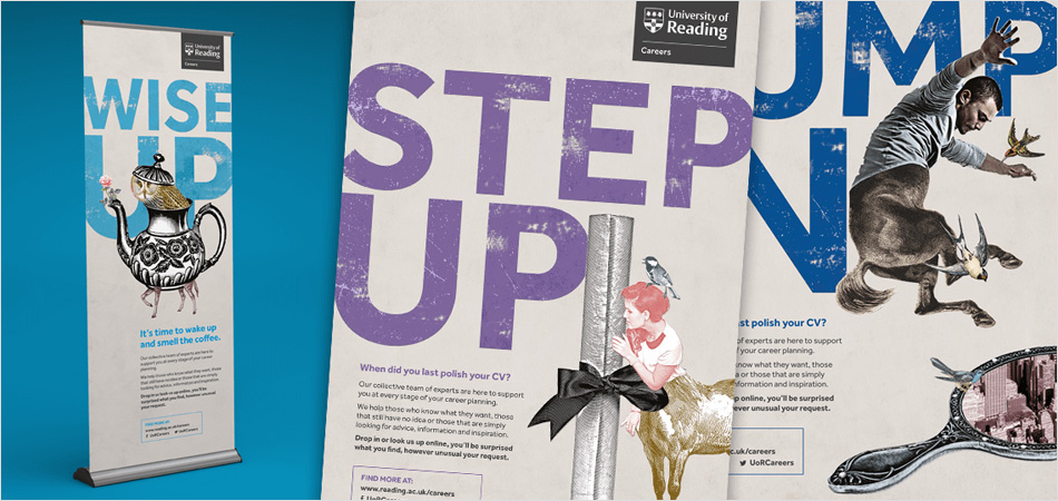
University of Reading Careers supports its students in achieving their potential and prepares them for the competitive employment market. Struggling with low levels of visibility and engagement, Reading needed to cut through the ‘noise’ of wider university messaging.
IE Brand began with audience listening through workshops with student, staff and Student's Union representatives, which revealed that Reading students needed a combination of gentle coaxing and a firm kick-up-the-backside. This informed a Jekyll and Hyde approach to the new brand. IE Brand created a set of beautiful, distinctive visual assets carrying powerful messages to support a host of campaigns and events throughout the academic year.
In the two years since the rebrand, the number of individual students taking advantage of appointments with the careers service have increased by more than 30%.
Read more about Reading's careers brand or explore IE's other rebranding work with university careers services.
CloseIE Brand's work genuinely surprised and delighted us. Challenging, pithy tag lines and intriguing, quirky imagery combine to deliver precisely the mix of behaviour changing messages that Reading Careers needed to drive up visibility and engagement. What's more, when we did a show and tell to our Vice Chancellor he ‘loved’ it!
Lorna Froud
Director of Careers and Employability, University of Reading
 Get in touch

Clergy Support Trust helps Anglican clergy and their families in times of need. They offer grants and wellbeing support to members of the clergy (including ordinands and retired clergy), as well as their dependants and partners – whether married, separated or widowed.
Explore our award-winning rename and rebrand for Clergy Support Trust (formerly Sons & Friends of the Clergy).
CloseIE Brand came on board at a time of considerable change for our 364-year old charity, which supports Anglican clergy and their families. Our old brand was part of our history, but was no longer relevant or accessible to today’s clergy. IE Brand helped with stakeholder engagement and in establishing the case for change through beneficiary research. We’re delighted with our new name and visual identity, which will enable us to reach more clergy families in need. We were impressed with the IE team, and have also now entrusted them with redesigning our website.
Jeremy Moodey
Chief Executive, Clergy Support Trust
 Get in touch
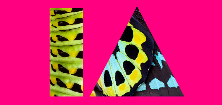
IE Brand created the dynamic, colourful new brand and website for the UCD Innovation Academy. Read the website case study.
IE Brand had also previously renamed and rebranded The Career Development Centre at University College Dublin, relaunching it as UCD Careers Network with a new website. UCD is the 12th university careers service to be rebranded by IE – and our first outside of the UK. Read more about UCD's Careers Network brand or explore IE's other rebranding work with university careers services.
CloseHaving done all the strategic ground work in house to transform the Careers Network, we turned to IE to bring it all to life through our brand. They did a fantastic job of engaging and exciting the whole team and reminding us how great we are at what we do! They understood us, and exposed the value we deliver to our key audiences in an engaging and accessible way.
David Foster
The new website guides students through the actions they can take and the help they need. We love the vibrant new visual identity, and the brand guidelines, templates and collateral have made the roll-out easy.
Director, UCD Careers Network
 Get in touch


Cranfield University is a postgraduate and research-based university specialising in science, engineering, technology and management.
Read about IE's rebrand for Cranfield University and our award winning brand architecture solution.
CloseIE Brand's careful listening, their insightful analysis of market research, their pragmatism, their profound understanding of the importance of internal engagement and their willingness to work in close partnership with Cranfield’s in-house team have all combined to deliver widespread support for a challenging project with high quality creative outcomes.
Madeleine McGowan
Director of Marketing, Communications and Development, Cranfield University
 Get in touch



The Church of England plays a vital role in the life of the nation, proclaiming the Christian gospel in words and actions. Its network of parishes cover the country, strengthening community life in numerous urban, suburban and rural settings.
The Church's Vocations Team approached IE Brand to commission a resource to help people to consider their calling – with the specific goal of widening diversity: encouraging more young people; more women; and more black, Asian and minority ethnic people to consider entering the ministry.
The result was an understated, typographically classical brochure covering everything from priesthood to monasticism, character attributes to the application process. Text was interspersed with stereotype-challenging photographs including a young Asian woman Vicar in a skate park, a pastiche of Michelangelo's The Last Supper with a diverse group of theological students studying at a long table, a black priest administering communion in the historic environ of Southwark Cathedral and the Archbishop of Canterbury washing feet at a festival.
Close
 Get in touch

University of Warwick’s Student Careers & Skills provides support, resources, workshops and events to help students and alumni make the most of their time at Warwick and prepare for their future.
They were under pressure to significantly improve upon student outcomes. Key barriers were lack of recognition – students simply not knowing that the service existed – and late engagement.
IE Brand introduced a powerful new campaign brand – My Warwick Journey – with striking visuals to break through the noise of a busy campus, arrest attention and drive up student engagement. Response to early creative work – right up to VC level – was so positive that budget was quadrupled and remit extended to marketing strategy, event planning and service rationalisation.
The work drove a 19% increase in appointment attendance and won Gold for Best Visual Identity at Europe’s premier re-branding awards, Transform.
Read more about Warwick's careers campaign brand or explore IE's other rebranding work with university careers services.
CloseIE Brand captured our brief and presented a stunning campaign brand, carefully placed within the university’s own brand identity. Already we are seeing a significant positive effect on levels of student engagement.
Siobhan Bennett
University of Warwick Student Careers & Skills
 Get in touch


Career Ready is a national charity that links education with business to prepare young people for the world of work.
CloseIE Brand put in the time and effort to really understand our charity and the work we do and this is reflected in the exciting, modern new brand they have developed for us. They have not only created far more engaging visuals, but have also helped us all to think about what we say about ourselves and how we convey those messages – it’s helped everyone to gain a positive, fresh perspective.
Allie Fitzgibbon
Head of Communications, Career Ready
 Get in touch


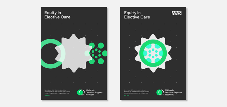
The Midlands Decision Support Network brings together 12 decision support units across the Midlands region to share experiences, exchange great practice and improve outcomes. The network is run by the NHS Midlands and Lancashire Commissioning Support Unit, for whom IE had already created The Strategy Unit and Digital Innovation Unit brands.
The Midlands Decision Support Network asked IE to create their new brand and WordPress website. The visual identity includes a set of circular graphics, typically shown in threes, and a vibrant colour palette of lime green, charcoal, electric blue and putty. The graphics represent networks and data coming together – logically and systematically – through applied intelligence and decision making.
Close
 Get in touch


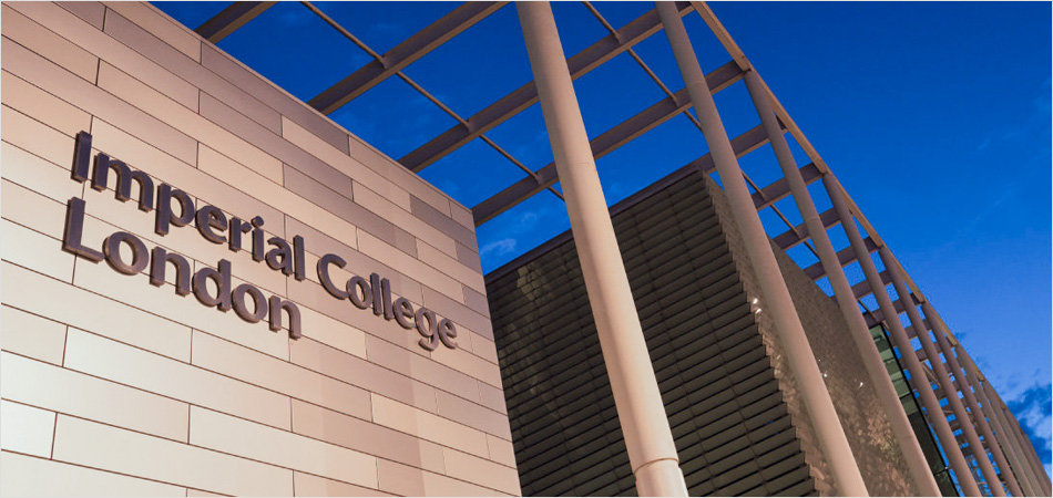
Imperial College London’s Careers Service provides varied and comprehensive careers guidance, information and a vacancy service to students and alumni at the university.
Stakeholder research showed that the service was suffering lack of understanding and student recognition. Beginning with a Strategy Workshop to the Career team, IE Brand went on to create a new visual identity for the service to raise awareness in a ‘noisy’ market.
IE Brand’s work resulted in a clear strategy, a newly expressed brand proposition and a striking new visual identity. We created brand guidelines detailing how to express the identity when working across the university and within individual faculties, as well as branded collateral, banners and magazine templates. Awareness and engagement levels among students increased, while careers staff confidence improved dramatically.
Read more about ICL's careers brand or explore IE's other rebranding work with university careers services.
CloseIE’s brand work has been transformational, they have succeeded in creating a distinctive and highly recognisable identity within the university’s strict, overarching brand guidelines, we are delighted with the overall value and impact delivered.
Richard Marshall
Information Manager, Imperial College London
 Get in touch



IE Brand created a new student recruitment campaign for TEDI‑London.
TEDI‑London is a new higher education provider for future engineers, founded by Arizona State University, King’s College London and UNSW Sydney. Their exciting general engineering degree bridges many disciplines, including mechanical, electrical and electronic, civil, environmental, and product design.
The campaign imagines what TEDI‑London's 2022 intake of students might achieve. To get applicants thinking about their contributions to the world over the next 10, 20 or even 50 years.
We scripted three films to tell the stories of three fictional students, with the students telling their own stories from their beginnings at TEDI‑London and then looking back 50 years later. Each one has forged a successful career and solved real-world problems in environmental sustainability, robotics, and smart cities.
CloseIE’s understanding of the higher education marketplace meant they were able to fully understand the strengths of our proposition as well as the challenges of being a new provider.
Helen Merrills
They came up with a quirky and genuinely unique idea that's gone down incredibly well. And it was great fun working with them on the campaign.
The campaign perfectly captures both our ambitions for the present and our ambitions for the future – a diverse and creative engineering workforce that makes a difference.
Director, Marketing at TEDI-London
 Get in touch


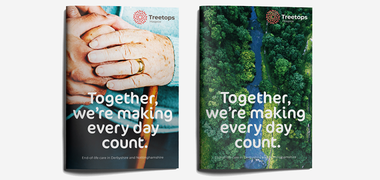
A vibrant new visual identity for Treetops Hospice. The charity offers nursing care and emotional support to adults and their families in Derbyshire and Nottinghamshire.
The new branding reflects the compassion and warmth of the Treetops experience and the natural landscape of Derbyshire and Nottinghamshire.
Close
 Get in touch


Brand research and messaging for Healthwatch, the health and social care champion.
Close
 Get in touch
The Strategy Unit is an established health and care consultancy, born from the NHS. As part of NHS Midlands and Lancashire Commissioning Support Unit, they help commissioners, healthcare providers, universities, charities, and Government to solve complex problems and make better, evidence-informed decisions.
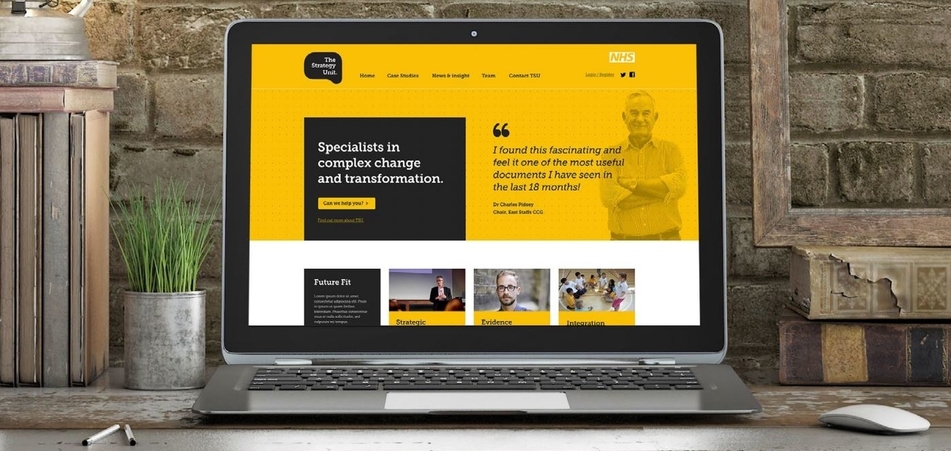
IE Brand created a distinctive new logo, brand and visual identity for The Strategy Unit, with a confident tone of voice and a more concise narrative for the services they offer. The Strategy Unit is now a simple brand for complex problems, demonstrating thought leadership and a passion for the subject.
IE Digital also designed and developed a new website in the new brand.
CloseIE did a great job in helping The Strategy Unit to reflect on ourselves, to succinctly re-articulate our distinctive offering, and to clearly define our relationship with the NHS. They deftly blended challenge and support in doing that. They have a method and a way of thinking that is well honed, well informed and effective. That was what we wanted!
Peter Spilsbury
The impact of the work has reached way beyond the provision of a new visual identity, messaging matrix, Drupal 8 website and marketing materials. It has extended to a sharpened sense of what The Strategy Unit is about and increased confidence in the way in which we present ourselves to the world.
Director
 Get in touch
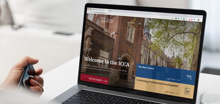
The Inns of Court College of Advocacy (ICCA) is the educational arm of the Council of the Inns of Court. They design and deliver a number of bespoke legal advocacy training and CPD courses, including a new two-part Bar Course.
As ICCA gradually moves towards delivering more of its learning content online, they realised their existing website wasn't up to the task. IE Digital designed and built a new WordPress website, creating a platform to host ICCA's legacy content and support the search and retrieval of new digital learning materials. It's also future-proofed for any integration with e-learning platforms in the future.
IE's designers created a modern new visual identity with a premium feel, including a set of ‘digital brand’ guidelines. We updated the logo to reproduce better online, and added a prestige colour palette, a bespoke icon set and pattern, and beautiful photography taken on location at the College with real students and practitioners. We also created various pieces of core collateral and templates to support ICCA's marketing team.
CloseWorking with IE Digital has been a very positive experience. They quickly understood what we wanted to achieve and the development process went extremely smoothly. The result is a website which not only looks great, but is thoughtfully designed and easy to administer. We are looking forward to a long and productive partnership!
Adrian Clarke
Digital Manager, The Council of the Inns of Court (COIC)
 Get in touch


Forum for the Future is a leading global sustainability non-profit.
For over 20 years Forum for the Future have been working in partnership with business, governments and civil society to accelerate the shift toward a sustainable future.
As part of a wider transformation, they came looking for a brand agency partner with experience of working with complex organisations. They appointed IE to create a credible brand that would reflect their international reach and knowledge, and speak to organisations across their core geographies: the UK, the US, the APac region and India.
Through the new brand messaging and visual identity, we’ve simplified their comms and helped them to connect emotionally with their audiences. The new logo is a window into the future – a window to a world that’s been positively transformed by Forum for the Future’s actions.
The new brand paints a truthful picture of a world facing significant challenges – but one that’s far from a lost cause.
CloseIE Brand helped Forum for the Future to bring renewed energy to our work by creating a distinctive new visual identity that beautifully represents our values, and truly reflects our ambitious vision for a sustainable future. Our funders and partners have commented on how the new look and feel is fresh, dynamic and really encapsulates what we’re trying to achieve. The distinctive sub-identity IE created for our School of System Change is also spot-on, reflecting the experimental and inclusive nature of our work to build a global community of system change practitioners – we're delighted!
Sally Uren
CEO, Forum for the Future
 Get in touch


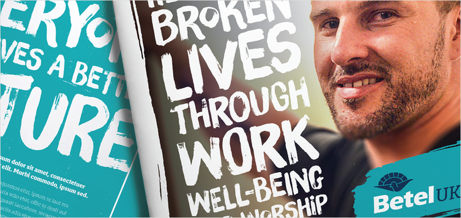
Betel UK is an independent Christian charity for people affected by drug and alcohol addiction. They thrive by training their residents to be furniture restorers, tree surgeons and landscape gardeners. This funds their work, and many residents go on to run the businesses and mentor others.
IE Brand carried out consultancy to clarify Betel’s proposition, focus its marketing messages and map its seven audiences, and redefined their messaging, proposition and tone of voice. This led to the creation of a fresh new visual identity that brings Betel’s work to life, emphasising the real people and success stories behind the organisation.
IE created new brand guidelines with variants for the five different Betel companies and designed and built a fully responsive new website. We also built a new ecommerce site for the "Restored by Betel" furniture business, and carried out a full review of Betel's pay-per-click advertising, unearthing a potential £50k improvement per year in PPC effectiveness.
CloseAn excellent personalised, customer centred service. We love the new brand and website. Thanks so much for all your hard work!
Chris Servante
Online Retail Manager, Betel UK
 Get in touch

