IE Brand works with charity, health and education clients up and down the UK, as well as internationally. Sometimes we work for large charities and universities that are household names, and sometimes we help small health and social care providers, colleges, or charity startups with big ambitions. If you’re a values-driven organisation with a challenge, then we’d love to add you to our list of clients!
- Home
- Brand Clients
Brand Clients


Having become no.2 in the floorcare category Vax recognised that the brand lacked a consistently managed, recognisable image. They had gained their position through an appeal to consumers on the basis of no nonsense value.
IE Brand repositioned the Vax brand, retaining the value aspect and complementing it with additional values such as expertise, technical innovation and care. We commissioned lifestyle photography and created a new set of brand guidelines to police and protect the new brand. We also revamped their packaging, catalogue layouts for Argos and Next, and designed and built new ecommerce websites – both B2C and B2B, in multiple languages.
Online sales more than tripled and Vax overtook Dyson in terms of unit sales and became the number 1 UK floorcare specialist.
CloseCongratulations on winning the pitch. It was a pleasure to see design with such clear strategic thinking. IE Brand was by far the best. I look forward to working with you in the near future.
Naomi Brennan
Marketing Communications Manager, VAX
 Get in touch

Sons & Friends of the Clergy is a charity whose roots can be traced as far back as Oliver Cromwell's time in the 1600s. The charity supports the Anglican clergy and their dependants in time of crisis or need, and they are now broadening their remit to incorporate general ‘clergy wellbeing’ including physical and mental health.
Close
 Get in touch


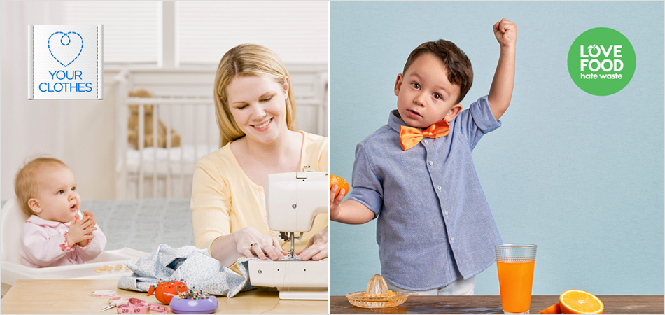
WRAP (The Waste and Resources Action Programme) works in the space between governments, businesses, communities, thinkers and individuals – forging powerful partnerships and delivering ground-breaking initiatives to support more sustainable economies and society.
Explore our rebranding work for WRAP with Love Your Clothes and Love Food Hate Waste.
CloseIE Brand has done an exceptional job of understanding the Love Your Clothes brand and re-invigorating our visual identity. Everybody loves the thinking, design, look and feel.
Jamie Perry
Creating a stand-out brand to appeal to our many disparate audiences is no mean feat, but IE has more than delivered to our challenging brief. What’s more, they have worked hard and been extremely responsive in the face of tight deadlines.
Mouth wateringly effective design delivered with polish and panache – highly recommended.
Campaign Manager, WRAP
 Get in touch


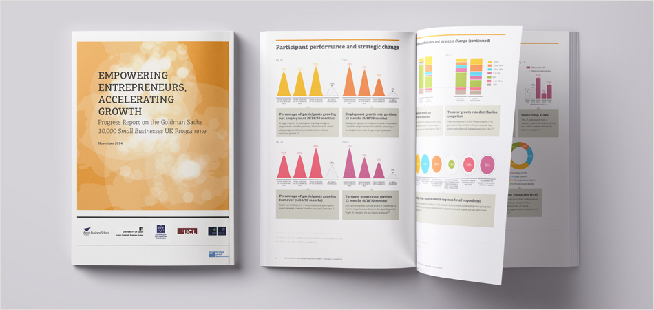
Goldman Sachs launched the 10,000 Small Businesses UK programme to identify businesses and social enterprises with high growth potential and to equip them to grow and build a plan to create jobs in their communities.
The programme is designed by leading experts and run in partnership with the business schools of the universities of Oxford (Said Business School), Aston (Aston Centre for Growth), Leeds, Manchester Met and UCL. The programme regularly produces reports demonstrating its impact, and contributing to key debates such as Brexit by surveying the views of its alumni.
IE Brand is the design partner for these reports, creating open, clean documents with timeless typography and understated elegance. We use innovative data visualisation techniques and craft beautiful infographics to walk the fine line between an academic paper and an accessible, visually engaging report.
When the first Progress Report launched at the 10KSB UK Alumni Conference, attended by 500 programme participants, it appeared 24 hours later in the business pages of The Times newspaper.
CloseThe 10KSB Programme is a key project to the university partners responsible for its delivery, so it was essential we appointed an agency that really understood our ethos and core aims. IE Brand inspired confidence in all of the delivery partners and proved the perfect choice. Their innovative, consultative approach combined with creative excellence was really refreshing.
Mark Hart
Programme Director and Academic Lead, Goldman Sachs 10,000 Small Businesses
 Get in touch


The Digital Innovation Unit is an award winning not-for-profit service, born from the NHS. Their impartial, evidence-driven team of sector-leading digital specialists do groundbreaking work, developing innovative digital solutions to improve health and care, and transform the NHS.
NHS Midlands and Lancashire Commissioning Support Unit (CSU) asked IE Brand to help them create a new brand for the Unit. We needed to simplify their offering and make it more accessible, while conveying their team's expertise and passion for the NHS. It needed to appeal to commissioners and providers in healthcare, as well as future audiences including: Government, networks and universities/think tanks.
The resulting brand messaging and visual identity conveys the Digital Innovation Unit's visionary, disruptive and rigorous approach, as well as bright, empathetic, and trustworthy personality. It's professional and credible, but still relaxed and informal.
Close
 Get in touch
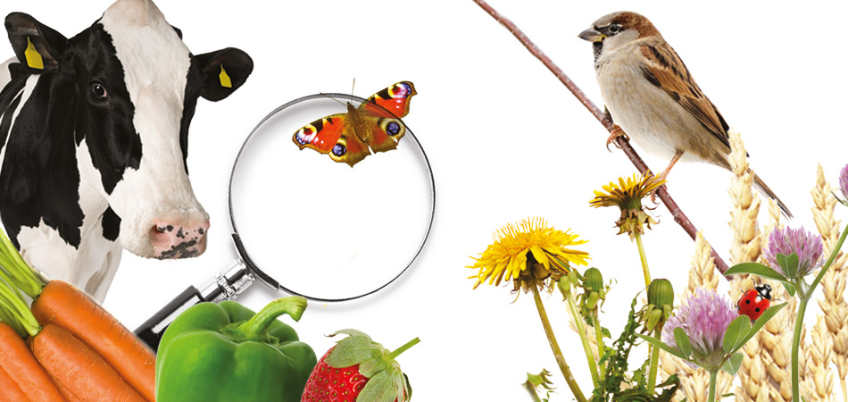
LEAF (Linking Environment And Farming) works with farmers, the food industry, scientists and consumers, to inspire and enable sustainable farming that is prosperous, enriches the environment and engages local communities.
Having previously worked with LEAF Education (formerly FACE – Farming and Countryside Education) to develop the new brand and website for Countryside Classroom, we were delighted to be asked to develop the latest campaign branding for Open Farm Sunday 2019. IE Brand created new promotional posters to help host farmers to promote their open day to the public, as part of LEAF's wider resource packs.
Close
 Get in touch


MSDUK is the UK’s leading non-profit membership organisation driving inclusive procurement. It promotes an ethos of diversity and inclusion in public and private sector supply chains, by identifying and introducing innovative and entrepreneurial ethnic minority owned businesses (EMBs).
Every year MSDUK runs a three-day global supplier diversity / inclusive procurement event attended by delegates from all over the world, which culminates in a prestigious award ceremony. IE Brand has twice worked with MSDUK to create a cohesive event concept for the evening, including art direction of the 'shortlisted candidates' film. Concepts have included 60s pop art inspired comic book superheroes to world music.
Close
 Get in touch


Countryside Classroom, is the largest partnership of its kind, bringing together organisations committed to helping children learn about food, farming and the natural environment.
IE designed a unique new visual identity and an educational website for the charity, bringing brings together the combined experience of around 30 partners, to share a range of inspiring information in a single, easy-to-use resource for schools.
CloseThere’s an excellent, searchable database of farms, green spaces and other places to visit, which you can filter by age, theme and curriculum subject... Countryside Classroom is superbly presented and highly informative.
Web User Magazine
★★★★

 Get in touch


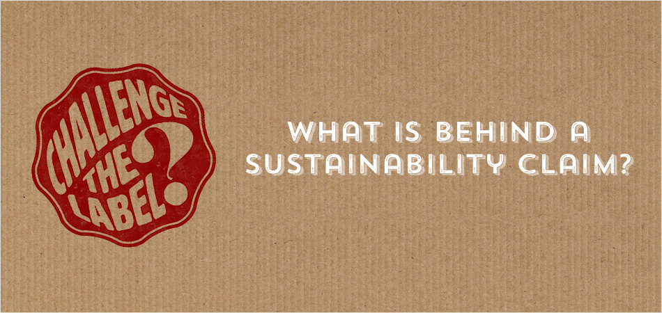
ISEAL is the global membership organisation for ambitious, collaborative and transparent sustainability systems. ISEAL is driving collective efforts to tackle the most pressing sustainability issues and create a world where Markets are a force for good.
ISEAL employed IE's brand and digital teams to create a campaign brand to encourage consumers to 'challenge the label'. The Challenge the Label microsite helps consumers distinguish between credible and non-credible sustainability claims – improving educated decision-making by leading people through the key questions in understanding a claim or label.
Close
 Get in touch


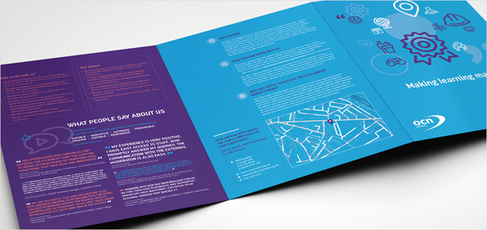
OCN London is a national not-for-profit organisation that creates and awards qualifications. Their mission is to help create a fairer society where everyone, whatever their educational background, has an opportunity to benefit from learning, realise their potential and fulfil their goals.
IE Brand has repositioned OCN London as a distinctive, values driven, educational charity operating within a crowded, fluid and highly competitive marketplace. We defined a new proposition, audience-specific messages, tone of voice – and refreshed their visual identity and brand guidelines in line with the new position.
Close
 Get in touch


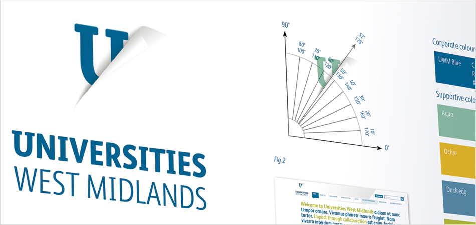
Universities West Midlands is a membership association for the thirteen Universities and University Colleges in the West Midlands.
The West Midlands Higher Education Association (WMHEA) – as they was then known – wanted to reposition themselves as the partner of choice for those seeking to engage with these universities.
IE Brand won the tender to carry out the brand work, going on to develop a new name, visual identity and rigorous brand guidelines document. We supported these with a content managed website, web tools, printed marketing materials and exhibition collateral.
CloseWe were looking for the best quality creative outcomes for our budget. We have chosen to return to IE Brand for additional projects because of their understanding of our organisation, their expertise and creativity.
Helen Carvell
Communications Officer, Universities West Midlands
 Get in touch


