
Charity
IE rebrands peacemaking charity CHIPS
We’re thrilled with the new charity brand identity we’ve created for CHIPS. The Christian peacemakers have unveiled their new brand narrative and visual identity to help them drive up fundraising – which will enable them to bring their unique peacemaking abilities to more divided communities around the world.
CHIPS (Christian International Peace Service) have big ambitions, and they realised they’d need to drive up fundraising income in order to achieve their strategic objectives.
CHIPS realised that their charity brand is key to communicating their personality, and would be a vital tool, in reaching out to existing, loyal audiences and recruiting new, multi-generational supporters. But their brand identity had been a little neglected in recent years, and the charity landscape had moved on. They knew they must move the brand forward, embrace new technology, and become more relevant to these audiences, or risk getting left behind.
Enter the charity branding experts...
CHIPS Director Paul Maxwell-Rose had met Ollie Leggett – IE’s MD and veteran Brand Consultant – at a charity conference and seen him wax lyrical on the subject of brand. Impressed with IE’s expertise and thorough, considered approach to the brand process, Paul approached us to help CHIPS through a rebranding exercise.
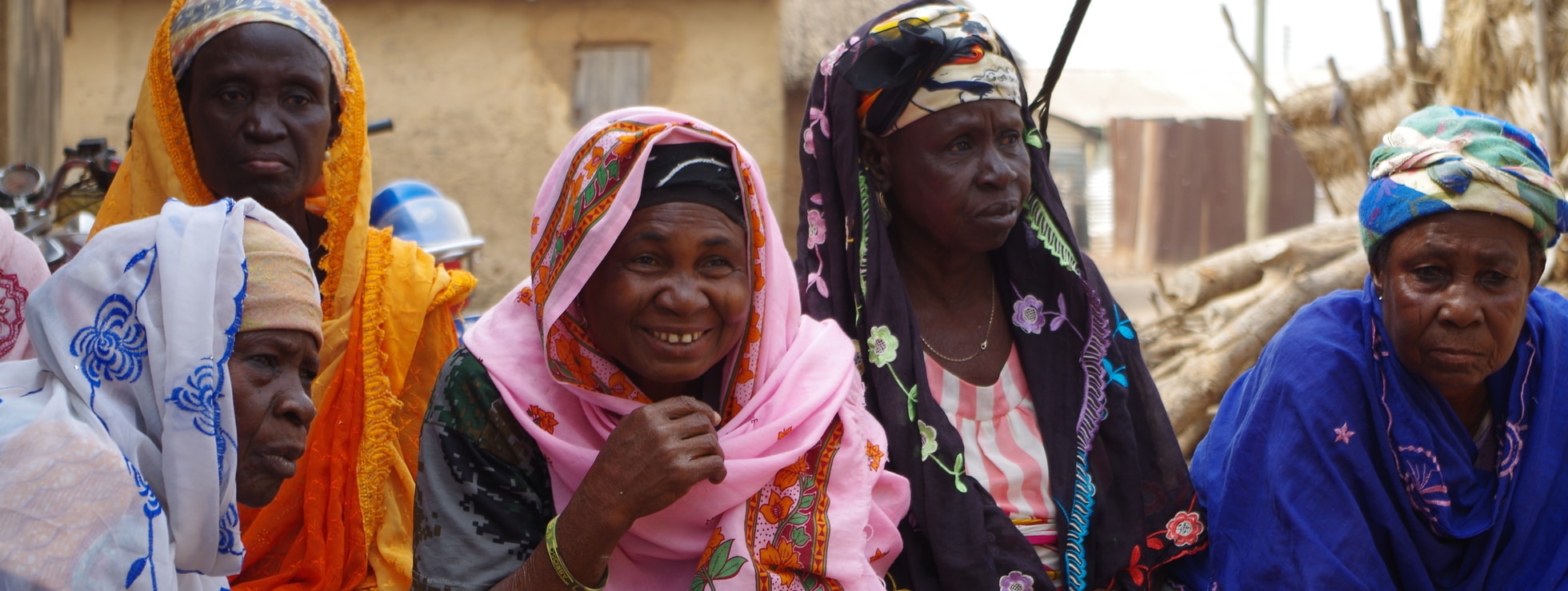
CHIPS is a charity that dives into the centre of a conflict – whether in Brixton or Ghana – to build lasting relationships between two sides of a divide. Through research and engagement with their stakeholders, IE Brand created an engaging new brand narrative, drawing out the four key beliefs at the centre of the charity:
-
We only go where we are invited
We believe that CHIPS should only go where people want us. Peace cannot be imposed upon communities in conflict. -
We live in the heart of the conflict
We believe that we must live amongst communities in the heart of the conflict in order to understand their challenges. -
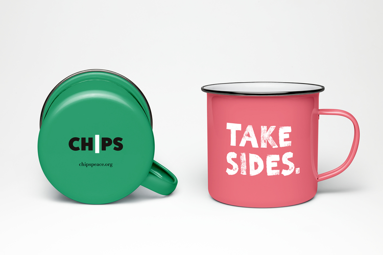
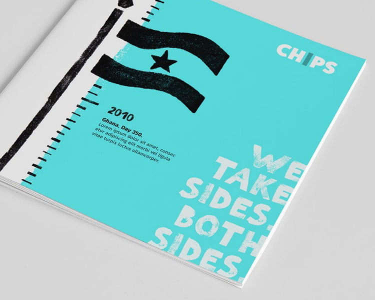
We take sides. Both sides.
We believe in taking sides. Both sides. We seek to understand everyone’s perspective, and to build relationships. -
We’re here to stay
We believe that a long-term commitment to sustainable development projects is the only way to achieve lasting results.
Bringing the brand to life through storytelling and visual identity
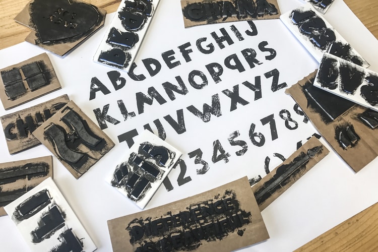
“We take sides. Both sides.” became the charity’s strapline, summing up what they do, in a uniquely attitudinal, human way. It not only describes what they do, but who they are and how they behave. IE’s brand designers took this idea through to the new CHIPS logo, using the central letter “I” to symbolise the divide they always straddle in their peacemaking. We created an exclusive hand-cut font, CHIPS Press, which adds a strong personality and grit. Complementary illustrations are based on repeat patterns, to convey the community and group work inherent to the charity’s work.
The colourful new visual identity is more confident, to support the bolder brand messaging and the many stories that CHIPS has amassed over more than 50 years. It’s a real investment in the future of the organisation, allowing them to shout louder with less effort. It’s versatile too, to accommodate the diversity of CHIPS’ projects – switching between looking ‘youthful/urban’ when talking about the Brixton Project, while looking humanitarian/traditional’ when talking about Ghana.
The new look, more confident CHIPS will be unashamed in asking their supporters for much needed funding to support their work – in addition to help through volunteering and prayer. This is reflected on the new CHIPS website – built with the help of a local agency – which features strong calls to donate. This in turn will enable CHIPS to continue its inspirational work, bringing reconciliation to divided communities at home and abroad, and improving life for people living in extremely challenging environments.
IE Brand were excellent at guiding our team, and challenging us where we needed to be challenged. Their wise, high-quality work to rebrand CHIPS will lead to a step-change for the charity. Awesome work!
Paul Maxwell-Rose
Director, CHIPS